
Google goes mobile
Mobile-first indexing is here. Here's how it will affect you and what you can do.

Will there be a day when you can finally say – I've mastered SEO?
Nope.
No SEO company or professional can ever claim they know everything about SEO. Do me a favor and fire them on sight if they do.
Every day, there will be something new in the world of SEO. Most recently, Google finally made a complete shift to mobile-first indexing.
What's mobile-first indexing?
63% of search done on Google is on a mobile. Considering that's a stat from 2019, the percentage should be higher now.
Mobile-first indexing is what it sounds like.
Google determines if your website deserves to be ranked, by evaluating the mobile version.
- If your website is optimized for mobile – you'll rank well for mobile and desktop.
- If your website doesn't work well on mobile – your ranking will drop on both desktop and mobile.
What can I do in a mobile-first indexing world?
First, it's understanding why Google is doing this.
It's to create a better experience for users, who are increasingly using their mobile phones to search and browse the internet.
Next, here are what to do:
Responsive design.
Don't confuse responsive design with adaptive design.
Adaptive design is about loading a web layout (usually with different content) to users. Responsive sites show the same HTML code on the same page, regardless of whether it's viewed on a desktop or mobile.
The layout is responsive. It re-orders the layout based on the viewing platform, producing a good user experience.
Make sure your mobile and desktop content is the same.
Because there is less viewing space on a mobile, I used to omit content on my website when it's viewed on a mobile – in hopes of providing a better experience for users.
- I'd write shorter headlines for the mobile version.
- I'd take out some photos for the mobile version.
- I'll skip some details. (Because hey, people scroll faster on a mobile, right?)
But then comes Google's warning:
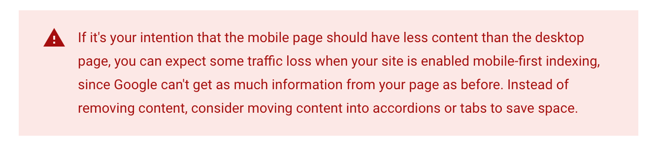
Uh-oh.
Omitting content (headlines included), from your mobile page is a bad idea, because Google will consider the mobile content first for ranking.
Be careful where your ads show up.
You know those ads that take up too much space above your mobile?
And your fat fingers can't seem to navigate past it, that you accidentally tapped on the ad?
That's bad experience. Google hates that.
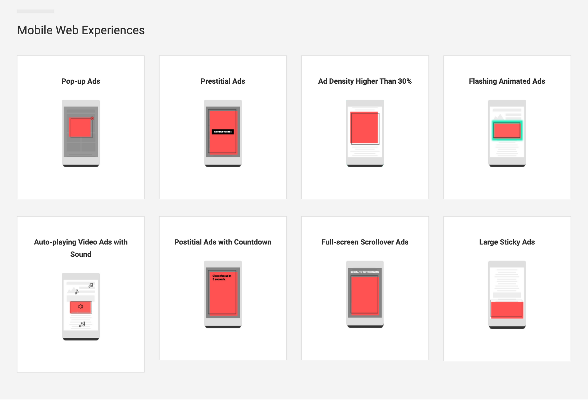
And it's not just ads. Interstitial banners and pop-ups count too.
Mobile site speed
Mobile phones these days are powerful. Still, they are not as powerful as desktops with WiFi connections – especially when you're faced with unreliable internet connection on a mobile phone at times.
If your website loads too slowly on mobile phones, your ranking will be impacted.
Usual culprits are large image sizes, bad internet connection, slower processor speed, and the mobile site design.
Design your website with the typical mobile user in mind.
You can use Google's page speed tool to test your website speed.
Design for fat fingers
Assume that all your users have obnoxiously fat thumbs, and design your website for it.

Make big buttons and make sure links are easy to click on, and hard to miss.
Everything that goes into making it easy to browse your website on a mobile phone, counts.
Want more?
Everything I shared should give you more than enough means to optimize and go mobile-first.
But I get it. You're a geek and you enjoy spending time reading technical SEO more than working on your business. Go ahead, read Google's entire documentation on mobile-first indexing best practices.
Want to rank your website? That's an area we can help.
Google 'ventilation block' and you'll see our client (HOMA) ranked 2nd. Or Google 'cooling tower specialist' and see another client (Threcell) ranked 1st.
Just reply with "SEO" if you're keen to explore SEO for your business.